

Case study
Atlaspay: a landing page for cross-border payments
UI designFigma
Problem
What needed fixing
Sending money across borders feels slow, costly and risky, so people hesitate. The page had to earn trust quickly, explain a payments product in plain language, and make it easy to start.
Approach
How I designed it
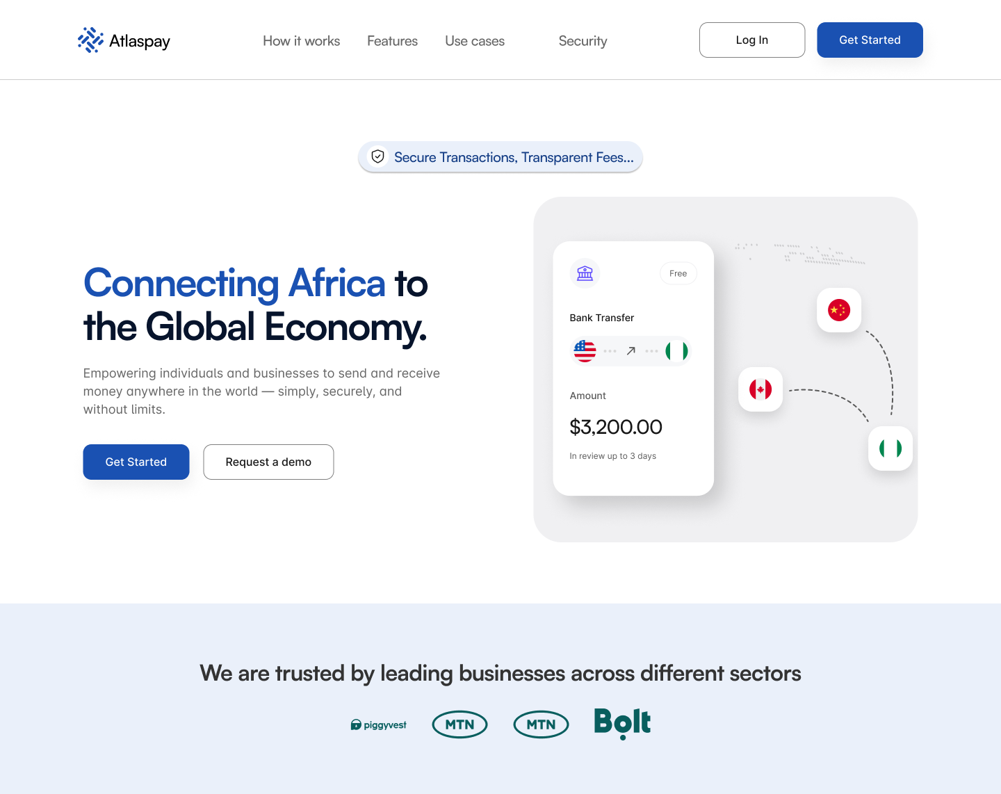
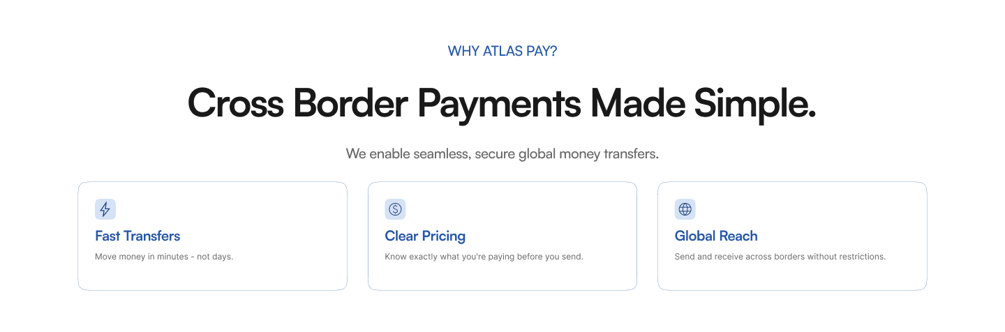
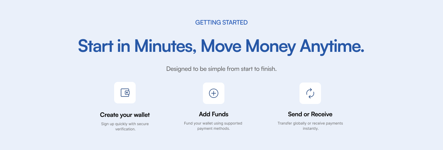
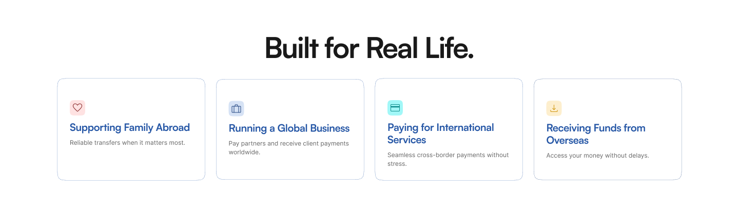
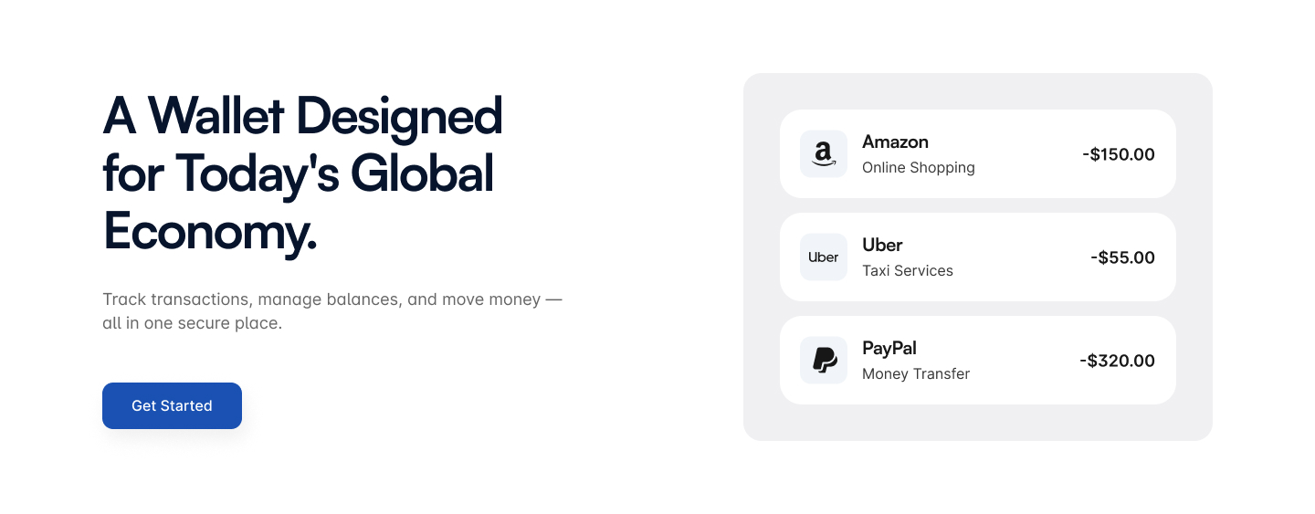
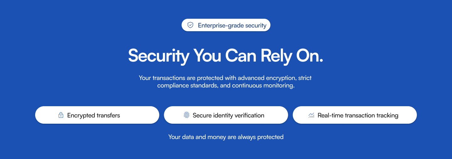
A clean blue-and-white palette keeps the page calm and credible. The hero pairs a direct promise (“Connecting Africa to the Global Economy”) with a live-looking transfer card, so the product is visible straight away. Short sections follow: three benefit cards (fast transfers, clear pricing, global reach), a three-step “start in minutes” flow, and four everyday use cases. A wallet preview with real-looking transactions shows what the app does, and a full-width blue security band puts reassurance right before the app-download call to action.

Result
What changed
A complete fintech landing page in eight sections, from hero to app download. Each section answers one question a new user would have, in the order they’d ask it: what is it, why trust it, how do I start, and where do I get it.