
Case study
Maisson: a fashion storefront for desktop and mobile
UI designFigma
Problem
What needed fixing
A fashion retailer has to feel like a magazine and still work as a shop. The page needed to carry collections, best sellers, store locations and a sign-up, and still stay calm, with enough room around each product to feel premium.
Approach
How I designed it
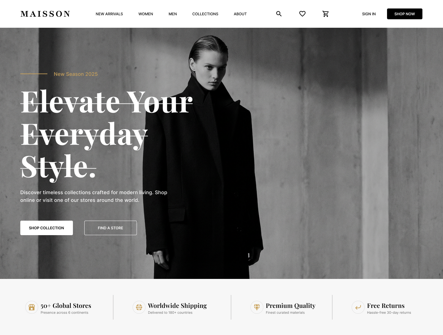
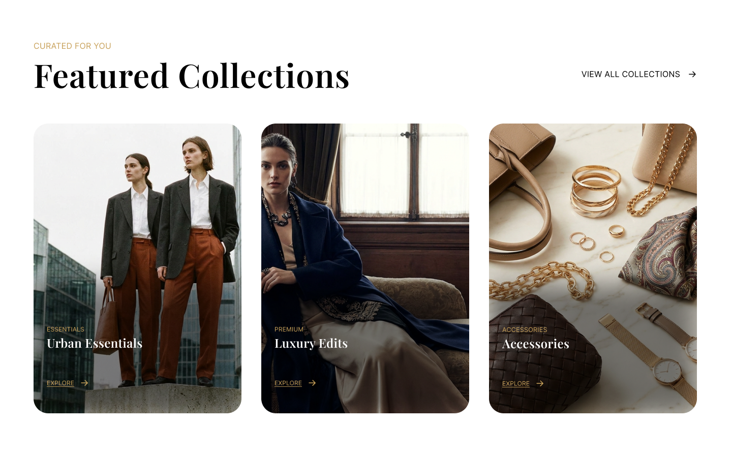
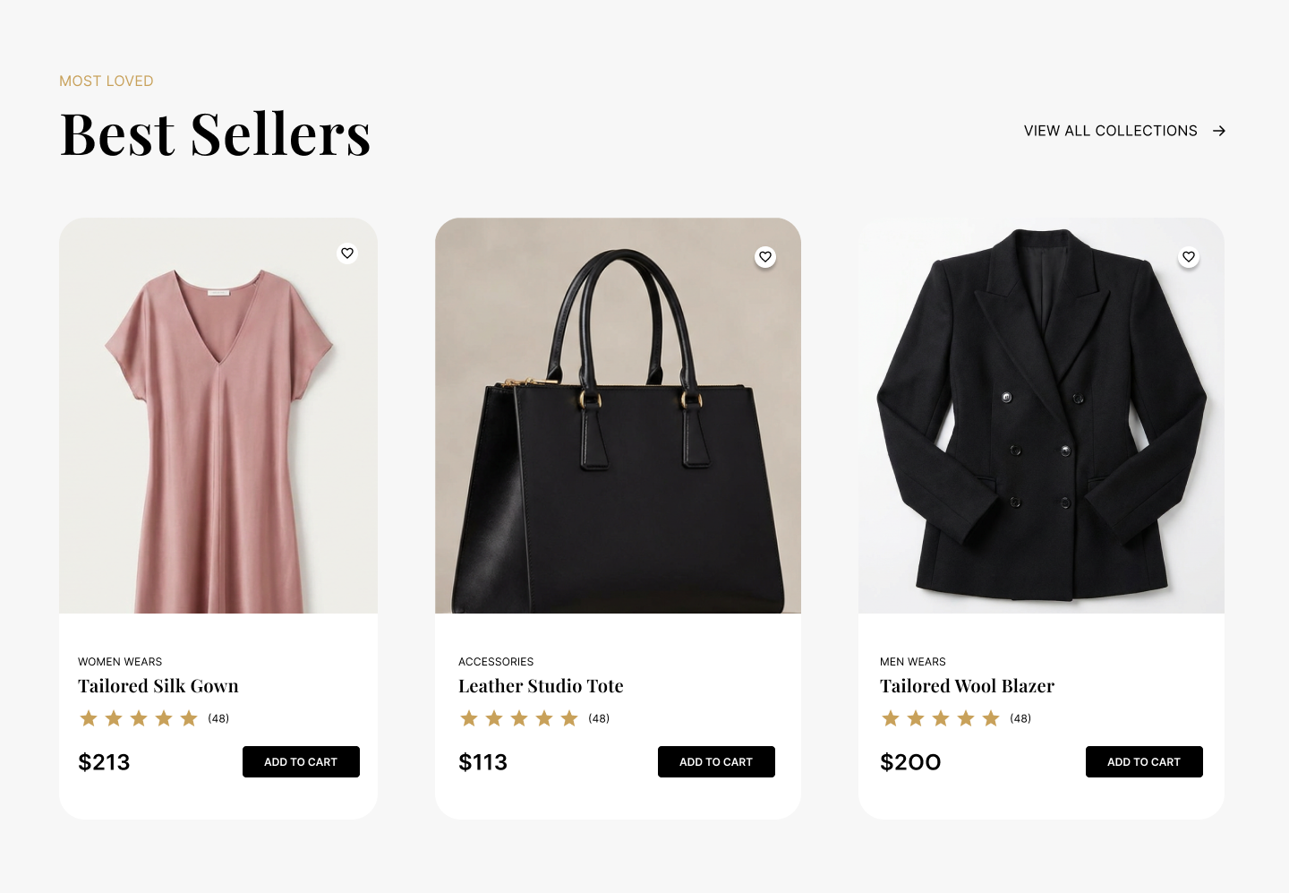
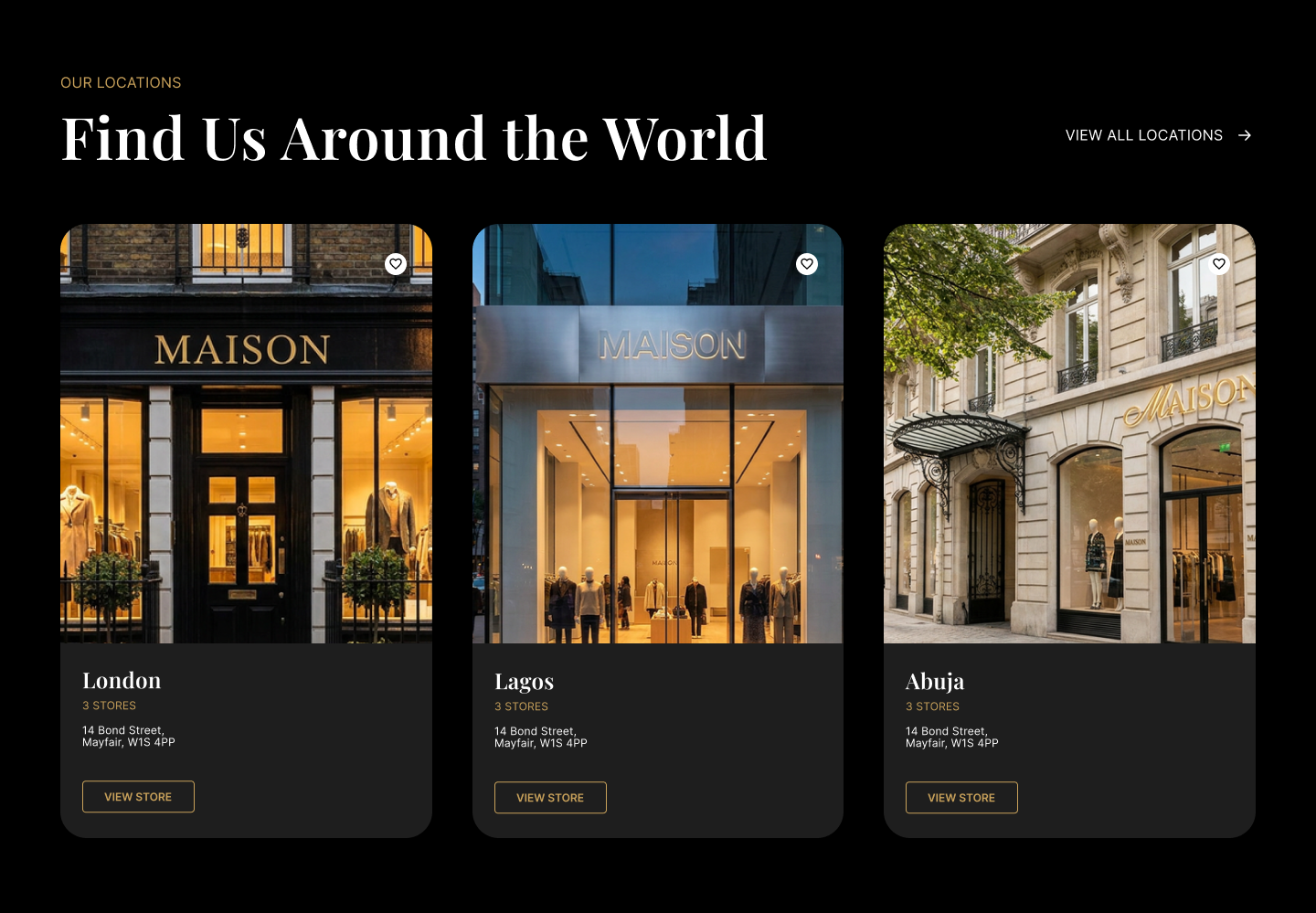
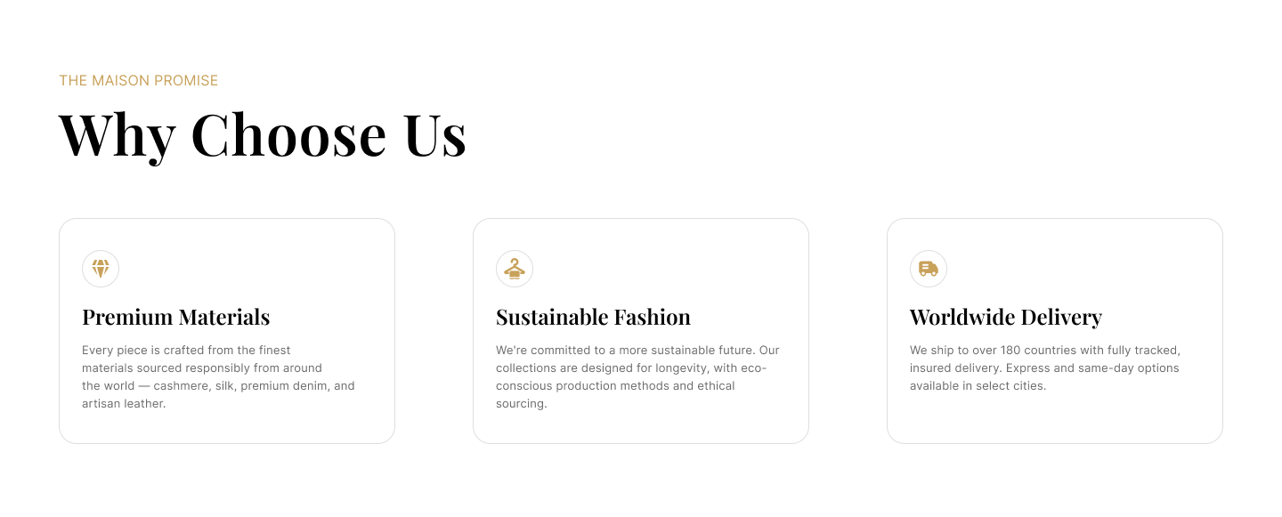
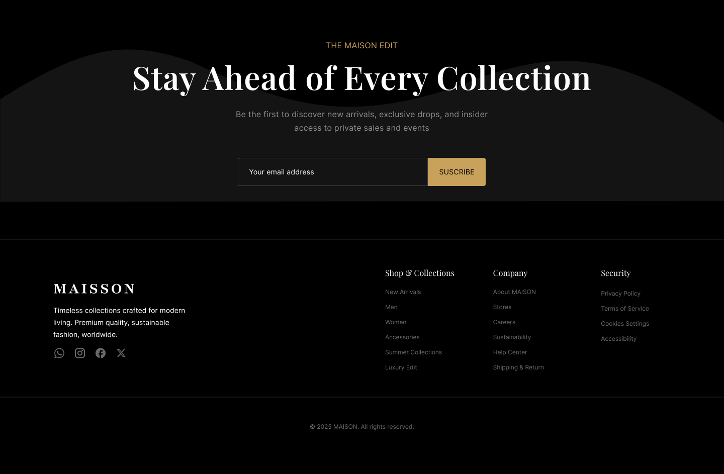
A full-bleed black-and-white hero with a serif headline sets an editorial tone from the first screen. A trust bar follows (stores, worldwide shipping, quality, returns), then Featured Collections and Best Sellers as clean card rows with price, rating and Add to Cart. A dark Locations section covers London, Lagos and Abuja, and a gold accent runs through the labels and the newsletter button. The mobile layout stacks the same sections into one column and keeps the same order, so nothing important gets lost on a small screen.
Result
What changed
A full fashion storefront in desktop and mobile layouts. It covers the main shopping journey: hero, trust bar, featured collections, best sellers, store locations and newsletter sign-up. The mobile version stacks the same content into a single column with the same hierarchy.